 This weekend, Rethinking Reentry staff had a chance to visit the Museum of Modern Art and discovered some reentry maps hanging on the walls of the Architecture and Design wing.
Since maps are one of the obsessions of this blog, it was quite a fascinating find. The Justice Mapping Center and Columbia University's Spatial Information Design Lab have teamed up on a number of justice-related mapping projects, perhaps the most famous of which are the "Million Dollar Blocks" charts. These are areas of the city where a million dollars (or more) has been invested in the incarceration of individuals on that one city block. The image below (at left) represents an area in Brownsville, Brooklyn where the state has invested $17 million to incarcerate people on these 17 blocks. Although hard to see, there is one individual represented on this map that cost the state about $2,900,000. The image at right represents prisoner migration patters from Brooklyn to facilities throughout New York State in 2003.
These maps have appeared in full exhibitions in the MoMA (see "Design and the Elastic Mind" -- under "Mapping," click on "Architecture and Justice") and at The Architectural League of New York. You can view full discussion of the connections between mapping and prison admissions in this document, published as guide to accompany the exhibit at The Architectural League.
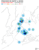
The Spatial Information Design Lab has also done some interesting work in collaboration with Columbia's Sociology department to map out the employment geography of reentrants when they come home.
That analysis has shown some interesting findings. From the report: "the majority of existing canonical research hypothesizes that illegal activity happens closer to the homes of those performing that activity. In contrast, our maps revealed that those engaged in illegal work, such as selling drugs, tend to navigate through more neighborhoods in the city and perform the activity farther from what they consider their home base. They are much more mobile than their counterparts who have legal jobs or no work at all, and leave their neighborhood more often. Our spatial analysis is surprising in that it establishes that illegal activity does not isolate formerly incarcerated people in their neighborhood, but rather, in some ways offers them the opportunity to leave. ... It is clear that the formerly incarcerated person who describes their work as “illegal” traverse a much larger portion of the city. Another preliminary finding of the spatial analysis is that it appears to be showing that formerly incarcerated people have strong ties between two or more neighborhoods. In other words the formerly incarcerated don’t just think of their neighborhood as where they live, but rather, as just one in a series that bonds them to several neighborhoods in the city."
There seem to be two main benefits in the ability to map these trends: first, you literally see patterns that you may not have seen. Beyond just points on a map, these mapping groups have inserted additional information in attaching budget dollars spent on each data point. How might we have realized that the state is spending $17 million on incarceration for 17 blocks of Brownsville without mapping it out? Second, the visual dimension of this medium helps make a strong point -- and the red, black, and white color choices don't hurt either -- about the depth of this problem. There are so many public sector issues that deserve our attention; strong graphics help stakeholders focus on the key problem at hand. If we discover, for example, that the state is spending millions of dollars on one apartment building in Brooklyn, we have a very localized phenomenon that can be addressed through targeted service provision, law enforcement efforts, and community action.
We'd be curious to hear how others out there have used mapping technologies to enhance their own reentry efforts? Did you learn something you may not have seen otherwise? Did you create some nice art in the process? Fill us in!


